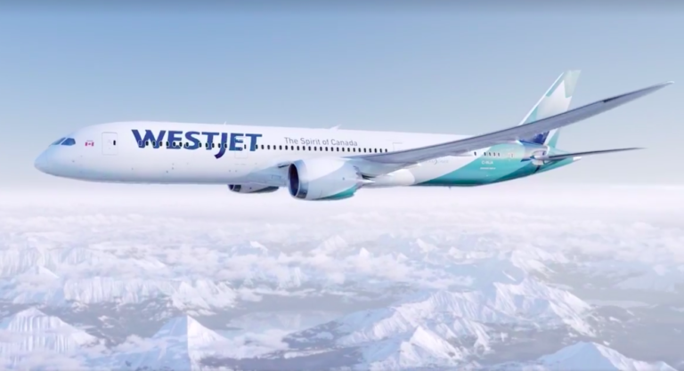
It's pretty boring. And someone should have told them that airplanes have windows. The Westjet name is all messed up by them.
Now the new AC livery, WOW. How a company could go from the worst toothpaste coloured airplanes to the most badass paint scheme out there is a mystery to me. Even a 737 looks good in the new AC paint, something I never thought I would see.
ahramin wrote: ↑Tue May 08, 2018 1:00 pm
It's pretty boring. And someone should have told them that airplanes have windows. The Westjet name is all messed up by them.
Now the new AC livery, WOW. How a company could go from the worst toothpaste coloured airplanes to the most badass paint scheme out there is a mystery to me. Even a 737 looks good in the new AC paint, something I never thought I would see.
Pretty sure they just copied Delta. Its lame and outdated...
"The Spirit of Canada" is very fitting, given the WAWCON management would want pilots to accept in exchange for flying a 787.
What does "The Spirit of Canada" script mean or do or have well, sweet eff all to do with any part of anything?! What self-congratulatory bs. As pretentious as people who refer to themselves in the third person.
Agreed with ahramin about the AC livery change. I no longer feel cringing shame when in foreign airports and see the (actual) national flag carrier.
---------- ADS -----------
I’m still waiting for my white male privilege membership card. Must have gotten lost in the mail.
It's okay... nice tail fin. I think they could have used some green/teal accents to liven up the fuselage.
ahramin wrote: ↑Tue May 08, 2018 1:00 pm
Now the new AC livery, WOW. How a company could go from the worst toothpaste coloured airplanes to the most badass paint scheme out there is a mystery to me. Even a 737 looks good in the new AC paint, something I never thought I would see.
I half disagree with you. While the blue/green was a bad livery, the new one is far from special. I have to agree with Boreas on that one... it's hard to distinguish an AC from a Delta plane at distance. Rouge has a better livery than mainline. There were some paint schemes floating around the internet they should have used because, they were sharp.
---------- ADS -----------
I'm going to knock this up a notch with my spice weasle. Bam!
I like it. The way they incorporate the chevron and the leaf on the tail is neat.
The AC livery, I rarely pass by it without commenting on what an upgrade it is. Although, compared to the toothpaste blue, it could be something akin to an average looking person next to an ugly one.
WestJet obviously over stepped their bounds with this one. The "Spirit of Canada" and layout of design is a straight copy of Quantas, and to be making claims as the "true" national carrier of Canada is ridiculous, especially changing the logo to a maple leaf (not that AC holds a TM on maple leaves), but seriously, are they trying to debrand and devalue AC by copying them? Not to mention their history of corporate espionage. Pathetic. I've very little respect for WestJet and their product whatsoever.
Don’t think it’s anything special, kind of bland IMHO and LOL at the “Sprit of Canada” which is a joke considering what’s going on at that company between its employees and management.
Plus, if they are so worried about the regionalism of the WEST in WestJet, how about renaming the airline then? Changing the colour of the word West is akin to Monty Python drag. You still know they're men no matter how they get into costume.
livery change, huge plans for expansion, aircraft purchase, all the money dumped into the start up of swoop.. RIGHT as the employee groups are pushing for proper wages and working conditions. Hmmm.. me thinks it is smoke and mirrors to show how 'terrible' the union contract is for the company as the stock tanks, and the profits drop off..
BTW- Its almost as ugly as the outgoing AC toothpaste paint scheme.


")


